To explain this project I am not allowed to write down any names or show any data, therefore I explain the methods, the instruments, and the final result.
From interview to low-fi prototype
Request from the company:
The client is a TV show publisher and its request was to design a web app to allow users to watch TV shows online and on-demand.
–
WEB-APP: TV online and on-demand
Key measurement successful
We started by identifying project goals and related KPIs that would then be used to measure project performance and progress. The two main KPIs that emerged were:
- site accesses
- permanence (episodes of terminated programs)
Telphone Interviews
The first task was to identify which people were in the target group and to carry out telephone interviews with them. This activity helped us to define their needs, habits, tastes and, behaviors.
We couldn’t rely on a recruiting agency besides no names were provided by the client since we didn’t have much budget for the research phase.
We decided to proceed with a more “homemade” solution: a list of friends in hand and a selection of those who were closest to the project use cases.
I must admit that friends are always a lifesaver in times of need, thanks to them we were able to obtain a lot of qualitative data that allowed us to proceed with a certain degree of confidence.
Social media research
We decided to proceed with social media research as the client is the publisher of an existing TV channel, which is also present on social media.
We read all the feedback and comments on the various channels that resulted in a comprehensive list of insights and pain points.
Personas and user journeys
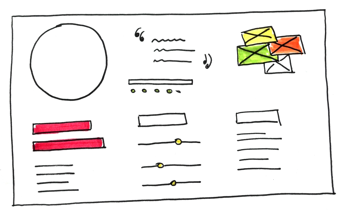
We were able to identify three personas by carefully analyzing the extrapolated data, clustering them using affinity maps.
We identified three types of people who search different content for, and this content is enjoyed differently.

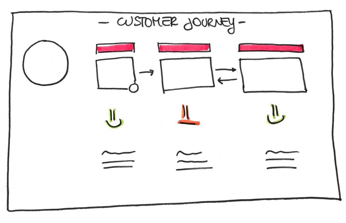
From the personas we created user journeys, more user journeys emerged per personas, this allowed us to cover a large number of scenarios.

Benchmarking and functional model
Having defined personas, scenarios, and customer journeys, we set up a benchmarking activity that allowed us to understand how other companies in the market offer their content.
The activity was carried out both at the national and international levels.
Very clear patterns emerged that allowed us to highlight a functional model.
We also looked for insights into realities that were not inherent to our sector, which allowed us to propose a solution that was different from the more popular ones.

Content strategy
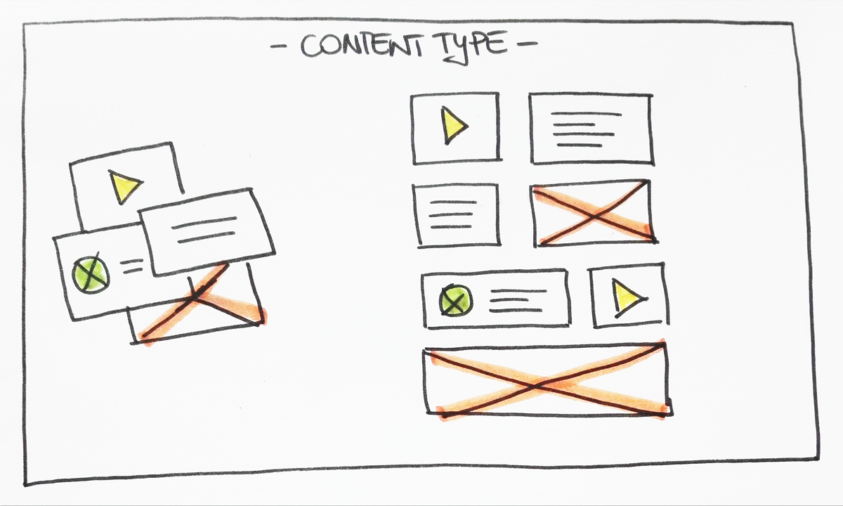
From the research and benchmarking activities, we extrapolated the type of content which, together with the content repository that emerged from the as-is, led to the definition of the list of content and how it should be displayed to ensure that it meets the needs of users.

Prototype
At this point it was time to connect all the dots, taking the personas with their user journeys, the content strategy, and the functional analysis we concretized by drawing user flow charts and wireframes to conclude with a low-fi prototype.
Everything was presented to the client, ready for the verdict of the final users through usability tests then.

_ Instruments
Figma
Airtable
Miro


